The Brief
A new company dedicated to coaching and workshops in the healthcare industry. The client was looking for a minimal logo that embodied their goals of shifting their customer's perspectives. They wanted something playful and professional, but not too corporate. Over all, the client gave a large degree of creative freedom, which is always fun.
The Ideation
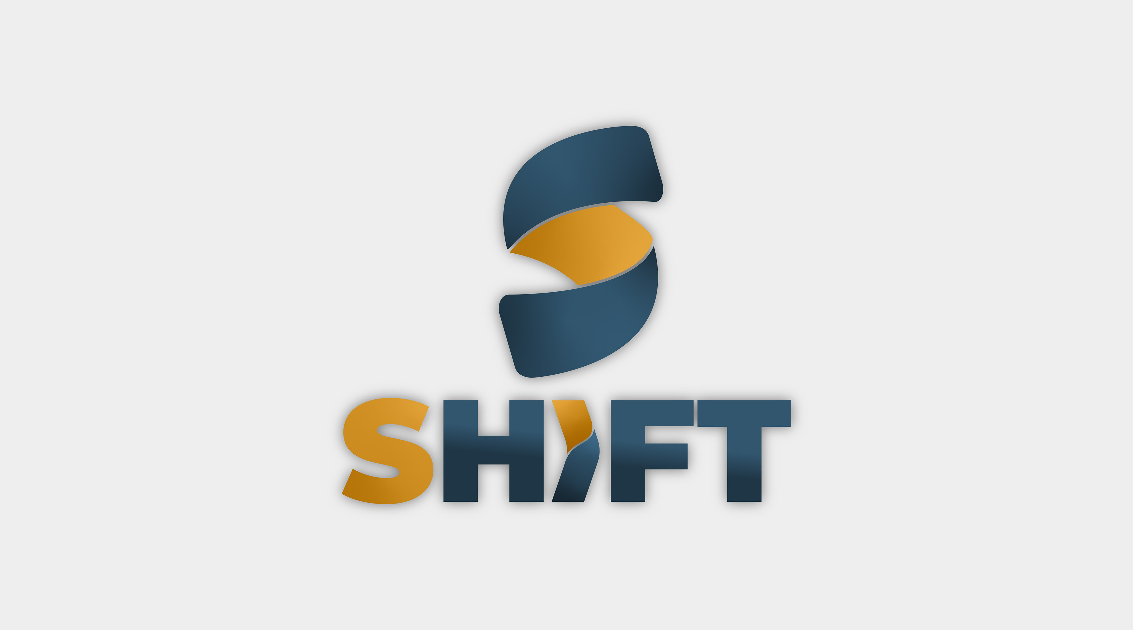
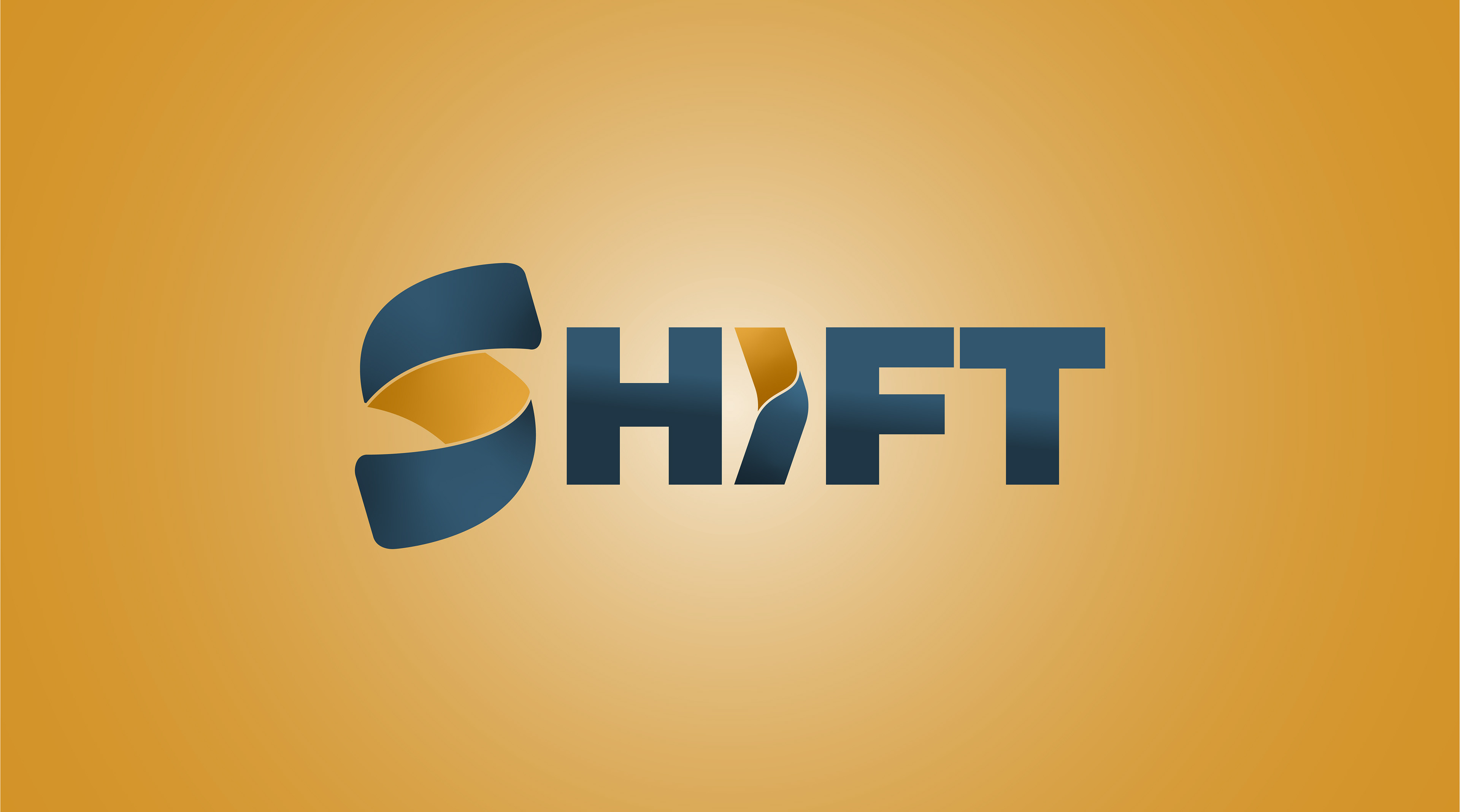
I wanted to work the idea of shifting or changing into the name. Starting with the "S" felt like the obvious place to begin as the shape of the letter already feels dynamic and implies movement. I wanted to keep the form simple while using color to add depth and a sense of motion.
The Solve
The final product included a vertical logo, a horizontal word mark, a minimal icon, and an abstract pattern made from elements of the logo.