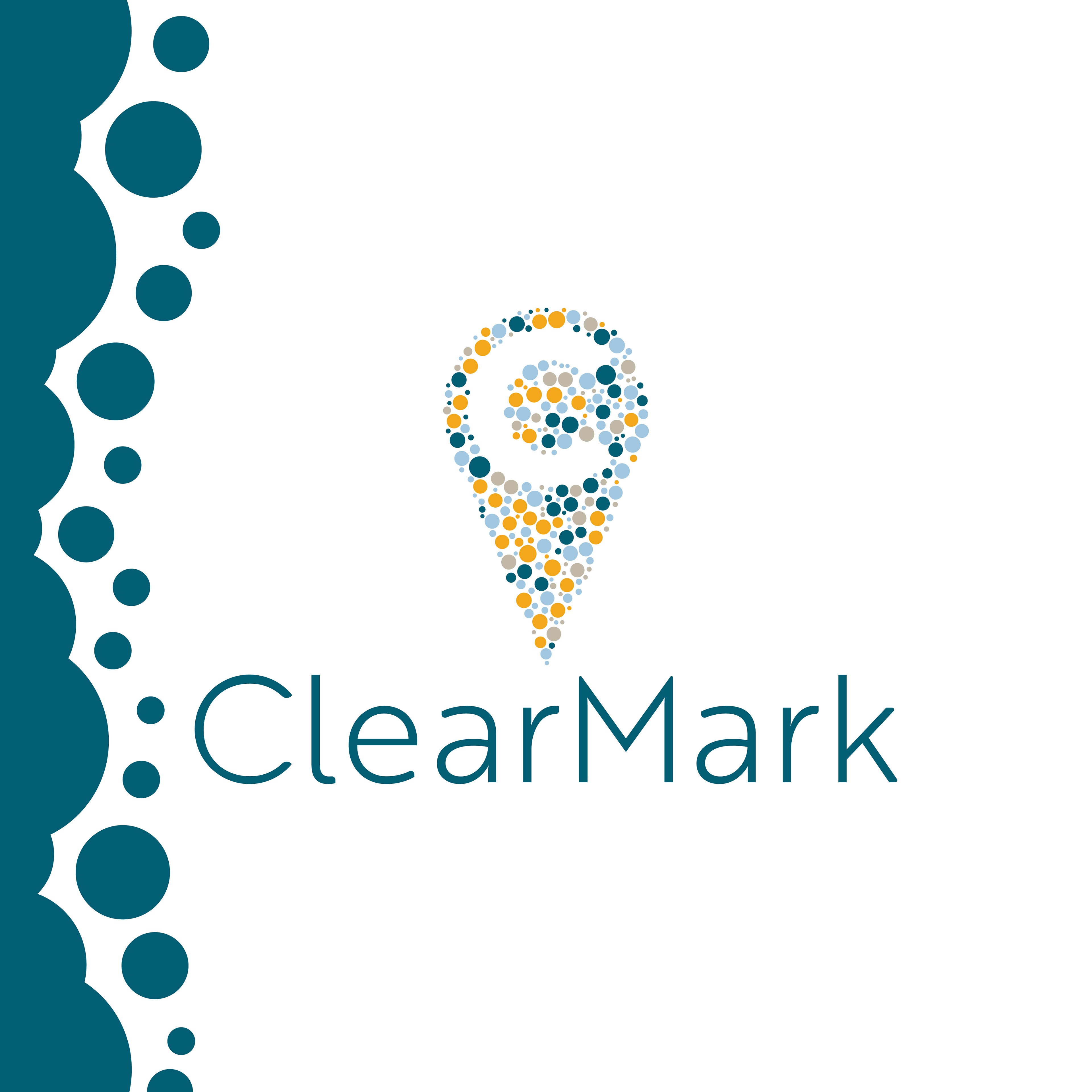
The Brief
A logo redesign that feels less sharp and rigid. They liked their colors but felt that their branding came across as too sterile. They wanted something that strode the balance between professional, expert, approachable, and fun.
The Ideation
The client was a marketing company that described their work as helping their customers clarify and refine their goals and then to achieve them.
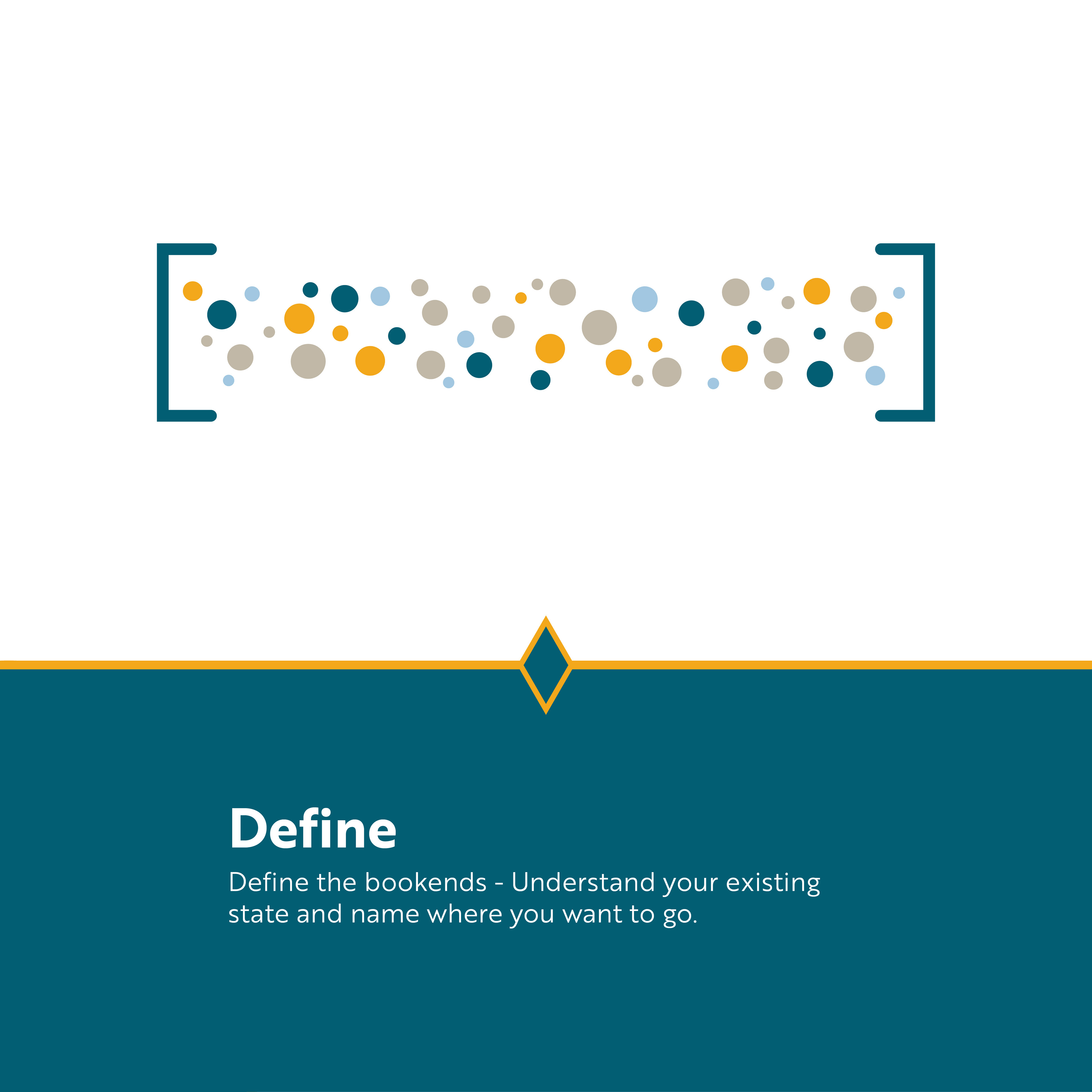
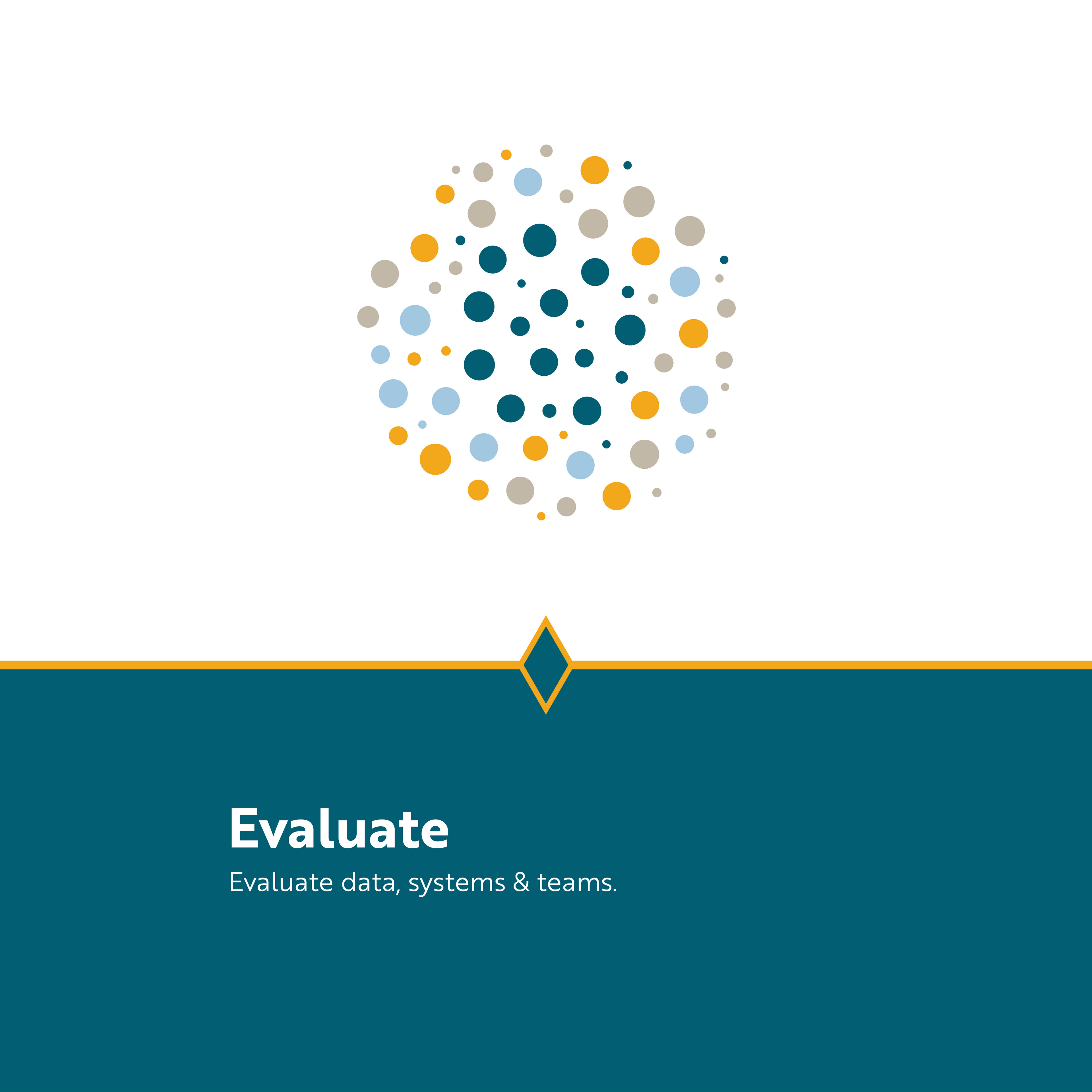
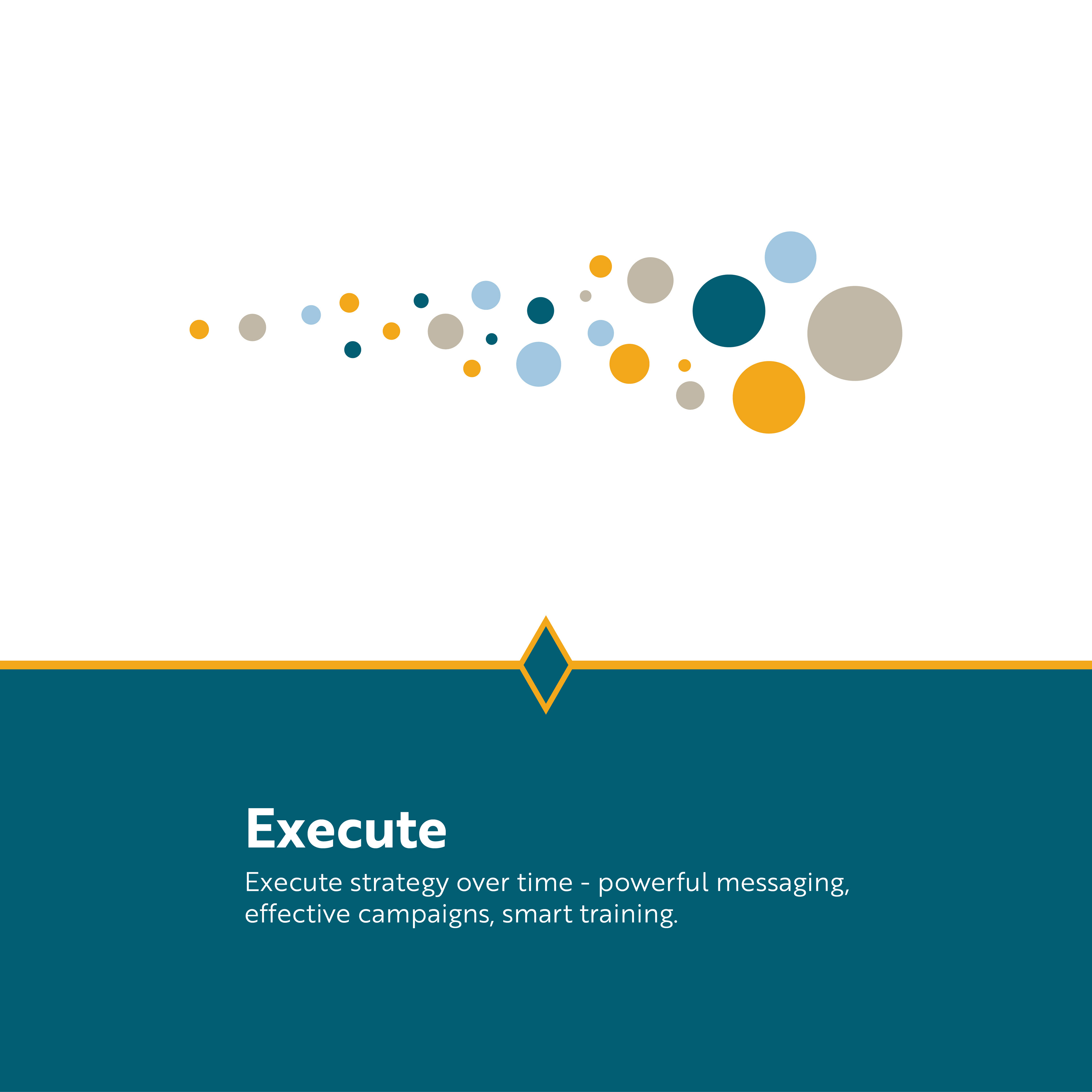
They also requested a process graphic that illustrated the four steps they walk each of their clients through to achieve their marketing goals.
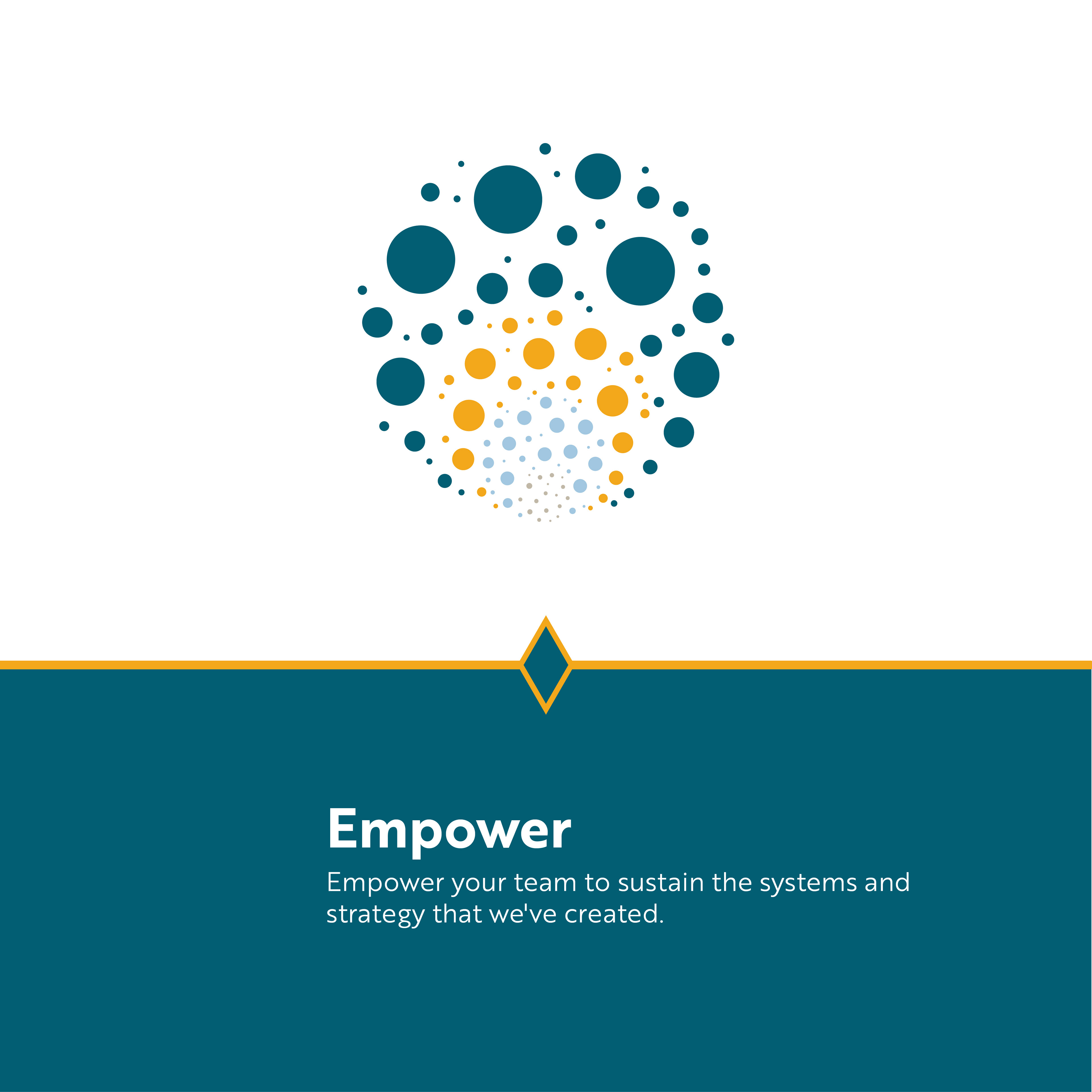
The Solve
Keeping in mind the process graphic, I created this logo to embody the compilation of the client's work. Marketing requires a ton of small parts coming together to make a whole picture. Additionally, the use of negative space to define the “C” was intended as a personification of the clarifying work that they do with their clients.
Similarly, I enjoyed using the individual dot components of the logo to create the process graphic.